Who-Are-Bostons-Most-Loyal-Fans
Answering who are Boston's most loyal fans
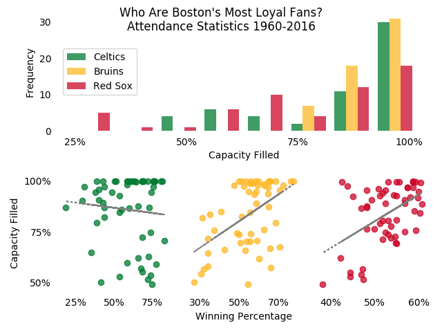
Who Are Boston’s Most Loyal Fans?
Ariel Aguilar Gonzalez
This project uses historical results and attendance data to estimate who are Boston’s most loyal fans. The final visualization utilizes Python’s Matplotlib library. Based on the correlation between winning percentage and stadium/arena capacity filled, Celtics fans are the most loyal bunch.
Data sources:
Boston Red Sox Data https://www.baseball-reference.com/teams/BOS/attend.shtml https://en.wikipedia.org/wiki/Fenway_Park#Seating_capacity
Boston Celtics Data http://www.celticstats.com/misc/attendance.php https://en.wikipedia.org/wiki/List_of_Boston_Celtics_seasons https://en.wikipedia.org/wiki/Boston_Garden#Seating_capacity
Boston Bruins Data http://www.hockeydb.com/nhl-attendance/att_graph.php?tmi=4919 https://en.wikipedia.org/wiki/List_of_Boston_Bruins_seasons https://www.tdgarden.com/the-garden/
Code in Python
Import Pandas library and data
import pandas as pd

chart_data = '...Boston_Fan_Loyalty_Data.xlsx'

celtics = pd.read_excel(chart_data)
bruins = pd.read_excel(chart_data, sheetname=1)
redsox = pd.read_excel(chart_data, sheetname=2)
redsox.head()
Set up Matplotlib stacked chart frame
import matplotlib.pyplot as plt
import numpy as np
import matplotlib.gridspec as gridspec

%matplotlib notebook

plt.figure()
# Set up plot grid of 2 rows and 3 columns
gspec = gridspec.GridSpec(2, 3)

# Top histogram will take up the first row and all of the columns
top_histogram = plt.subplot(gspec[0, 0:])
# Second row, first column
bottom_left = plt.subplot(gspec[1, 0])
# Second row, second column
bottom_centre = plt.subplot(gspec[1, 1])
# Second row, third column
bottom_right = plt.subplot(gspec[1, 2])
Fill in chart frame with data
# Define line of best fit function

def best_fit(X, Y):

    xbar = sum(X)/len(X)
    ybar = sum(Y)/len(Y)
    n = len(X) # or len(Y)

    numer = sum(xi*yi for xi,yi in zip(X, Y)) - n * xbar * ybar
    denum = sum(xi**2 for xi in X) - n * xbar**2

    b = numer / denum
    a = ybar - b * xbar

    return a, b

# Isolate data series
c_pc = celtics['Percent_Capacity']
b_pc = bruins['Percent_Capacity']
r_pc = redsox['Percent_Capacity']

c_wp = celtics['Win_Percent']
b_wp = bruins['Win_Percent']
r_wp = redsox['Win_Percent']

# Create top histogram
top_histogram.clear()
top_histogram.hist((c_pc,b_pc,r_pc), bins=8, label = ("Celtics", "Bruins", "Red Sox"), color=['#007a30','#fdb927','#ca0629'], alpha=0.75)
top_histogram.legend(loc=6)
# Limit the number of labels on the x axis
top_histogram.set_xticks((0.25, 0.5,0.75,1.0))
top_histogram.set_xticklabels(('25%', '50%', '75%', '100%'))
# Define axes labels
top_histogram.set_xlabel("Capacity Filled")
top_histogram.set_ylabel("Frequency")
# Turn off chart frame and tick marks
for spine in top_histogram.spines.values():
    spine.set_visible(False)
top_histogram.tick_params(
    axis='both',
    which='both',
    bottom='off',
    left='off')

# Create scatter plots of Celtics, Bruins, and Red Sox

bottom_left.clear()
bottom_left.scatter(c_wp,c_pc, color='#007a30', alpha=0.75)
bottom_left.set_yticks((0.5,0.75,1.0))
bottom_left.set_yticklabels(('50%', '75%', '100%'))
bottom_left.set_xticks((0.25, 0.5,0.75))
bottom_left.set_xticklabels(('25%', '50%', '75%'))
bottom_left.set_ylabel("Capacity Filled")
# Add in line of best fit
# Find y-int and slope
int_c, slope_c = best_fit(c_wp, c_pc)
# Compute points of the line of best fit for each x value
cfit = [int_c + slope_c * xi for xi in c_wp]
bottom_left.plot(c_wp, cfit, color='grey', linestyle=':')
for spine in bottom_left.spines.values():
    spine.set_visible(False)
bottom_left.tick_params(
    axis='both',
    which='both',
    bottom='off',
    left='off')


bottom_centre.clear()
bottom_centre.scatter(b_wp,b_pc, color='#fdb927', alpha=0.75)
bottom_centre.set_xticks((0.30, 0.5, 0.70))
bottom_centre.set_xticklabels(('30%', '50%', '70%'))
bottom_centre.set_xlabel("Winning Percentage")
b_wp_xna = b_wp.dropna()
b_pc_xna = b_pc.dropna()
# Take out NaN value from Bruins lockout season
int_b, slope_b = best_fit(b_wp_xna, b_pc_xna)
bfit = [int_b + slope_b * xi for xi in b_wp_xna]
bottom_centre.plot(b_wp_xna, bfit, color='grey', linestyle=':')
for spine in bottom_centre.spines.values():
    spine.set_visible(False)
bottom_centre.tick_params(
    axis='both',
    which='both',
    bottom='off',
    left='off',
    labelleft='off')

bottom_right.clear()
bottom_right.scatter(r_wp,r_pc, color='#ca0629', alpha=0.75)
bottom_right.set_xticks((0.4, 0.5, 0.6))
bottom_right.set_xticklabels(('40%', '50%', '60%'))
int_r, slope_r = best_fit(r_wp, r_pc)
rfit = [int_r + slope_r * xi for xi in r_wp]
bottom_right.plot(r_wp, rfit, color='grey', linestyle=':')
for spine in bottom_right.spines.values():
    spine.set_visible(False)
bottom_right.tick_params(
    axis='both',
    which='both',
    bottom='off',
    left='off',
    labelleft='off')

# Title the plot and tighten the layout
plt.suptitle("Who Are Boston's Most Loyal Fans?\nAttendance Statistics 1960-2016")

plt.tight_layout()